Net Worth Over Time
The Net Worth Over Time report shows the sum of every account balance you track, plotted as a single line over time. It answers the biggest-picture question in personal finance: "Is my overall financial position getting better?"
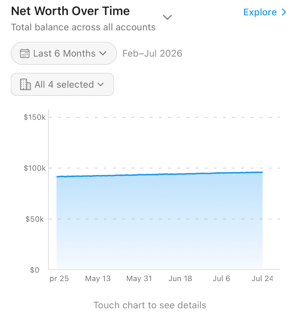
Net worth over the last 6 months, filled beneath the line
Finding the Report
Open the Reports tab and choose Net Worth Over Time from the report selector at the top of the screen. Its subtitle reads "Total balance across all accounts."
Reading the Chart
The chart plots one line — your total net worth — with the area beneath it filled in:
- Line trending up — Your net worth is growing (saving, investing, paying down debt)
- Line trending down — Your net worth is shrinking (spending down savings, taking on debt)
- Blue line — Net worth is positive
- Red line — Net worth is negative (you owe more than you own)
The vertical axis abbreviates large amounts (for example, $25k for twenty-five thousand), so the chart stays readable no matter how big the numbers get.
The Summary Card
Below the chart, a Summary card gives you the numbers at a glance:
- Current Net Worth — Your total across all tracked accounts, taken at the latest point in the selected period (this is "now" for ranges that end today, but the range's final value for a historical window)
- Change — How much your net worth moved over the selected period, as an amount and a percentage
- Accounts Tracked — How many accounts contribute to the total
Point Details
Touch and hold anywhere on the line to inspect that moment in time. A detail panel shows the Net Worth on that date, the Change up to that point, and a breakdown by account type:
- Depository — Checking, savings, and cash accounts
- Credit — Credit cards
- Loans — Loan and mortgage balances
- Investment — Brokerage and retirement accounts
- Apple Cash — Apple Card and Apple Cash balances
- Crypto Wallets — Tracked crypto addresses
- Other — Anything that doesn't fall into the categories above
Before you touch the chart, the panel prompts "Touch chart to see details."
Where the Data Comes From
Net worth is built from balance snapshots — point-in-time records of what each account was worth:
- Connected accounts (bank, Apple, crypto) contribute snapshots automatically each time they sync. You don't have to do anything.
- Manual accounts contribute the balance entries you add yourself on the account's Balance History screen.
Because the report is built from snapshots rather than individual transactions, it reflects the actual recorded value of each account over time.
Choosing a Time Range
Use the date selector (calendar icon) to change the window:
- Past 7 Days
- Last Week
- This Month
- Last Month
- Last 3 Months
- Last 6 Months
- Last 12 Months
- Last Year
- All Time
A longer range is best for spotting the overall trend; a shorter range highlights recent movement.
Filtering Which Accounts Count
By default every account is included. To focus on a subset, tap the account filter chip and open the Filter Accounts modal:
- Check or uncheck individual accounts (each row shows the account name and its institution)
- Use Select All / Unselect All to toggle everything at once
- Tap Done to apply
The filter chip reflects your selection — for example "All 5 selected," "3 selected," or the account's own name when you've narrowed to just one.
This filter is scoped to the report view — it changes what the chart shows without permanently excluding any account.
Including Crypto
If your workspace tracks crypto addresses, a separate Crypto toggle lets you include or exclude their value from the net worth line.
Jumping Straight to One Account
From an account's action menu, choose View in Net Worth report to open this report pre-filtered to that single account — a quick way to see one account's value trajectory in the same view.
Related Features
- Reports Overview — All reporting tools
- Balance History — Per-account value over time
- Transaction Activity — Counts and amounts by month or category
- Manual Accounts — Add balances that feed this chart