Transaction Activity
The Transaction Activity report turns your transactions into a chart so you can see patterns at a glance — how much money moved, whether it was income or expense, and where it was concentrated. Its subtitle reads "Transaction count and amounts."
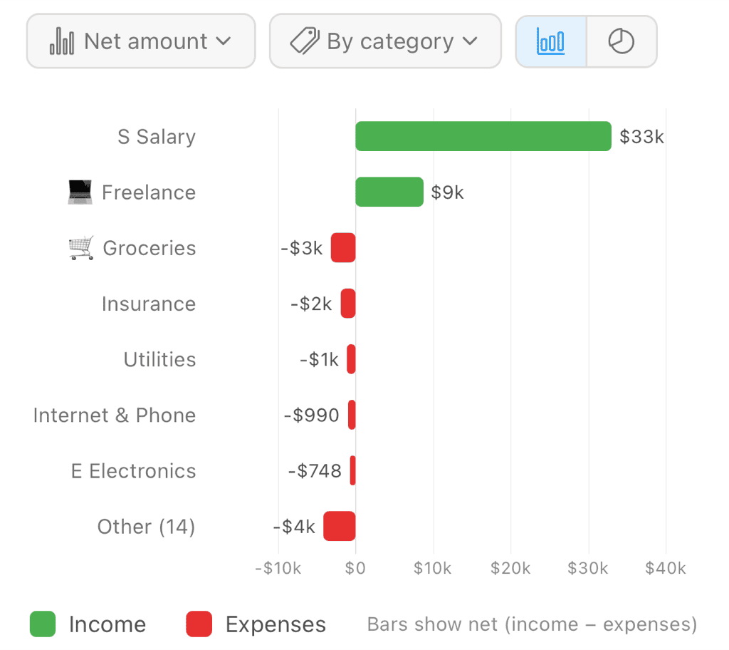
Net activity by category — income bars extend right, expenses left, with smaller categories folded into "Other"
Finding the Report
Open the Reports tab and choose Transaction Activity from the report selector at the top of the screen.
What to Measure
Tap the Show control to pick what the chart measures:
- Count — The number of transactions in each bucket. Great for spotting busy periods or frequently-used categories.
- Net amount — Income minus expenses. Bars rise above the zero line (green) when you netted positive and drop below it (red) when you netted negative.
- Income & expenses — Income and expenses shown separately: income above the line (green), expenses below (red). Use this when the net figure hides how much was actually moving in both directions.
How to Group
Tap the Group by control to choose how the data is organized:
- By month — One bar per month, so you can compare periods over time.
- By category — One row per category, so you can compare where activity is concentrated.
Category Bars Diverge From Zero
When you group By category with Show set to Net amount or Income & expenses, the chart draws horizontal diverging bars. Each category's bar extends from a shared center line:
- Right of center (green) — Positive / income
- Left of center (red) — Expenses
A legend labels the two directions Income and Expenses, with helper text explaining that "Bars show net (income − expenses)." When you're viewing Income & expenses, a category can show a bar in both directions, and a Money moved total sums the gross activity (all income plus all expenses).
With Count selected, category bars aren't diverging — each extends rightward only and is tinted with the category's own color, since a transaction count has no income-versus-expense direction.
The Transfers Row
Money you move between your own accounts isn't spending, so it doesn't belong to any spending category — but it isn't nothing, either. Grouping By category gives transfers their own row labeled Transfers, alongside your real categories and separate from Uncategorized. This matches how the Explorer groups by category.
Two things to know about it:
- It never folds into Other. However small it is, the Transfers row stays visible on its own.
- It isn't counted in the totals. The summary figures above the chart — total transactions, income, expenses, and net — leave transfers out, so moving $2,000 from checking to savings doesn't read as $2,000 of income and $2,000 of expenses. The row is there so you can see the internal movement, not so it inflates your spending.
Selecting the Transfers row offers both View Transactions, which opens the transfers list, and Explore, which regroups just your transfers by recipient (who you move money between) or by month (when you move it). Grouping them by category isn't offered — they'd all collapse back into this one row. The same drills are available from the Transfers row in the Explorer itself.
If a lot of what you expected to see under Uncategorized turns out to be transfers, that's usually the answer to "why are so many of my transactions uncategorized?" — and you can confirm or correct each one from the transfers list.
The "Other" Bucket
To keep category views readable, the chart shows the largest categories individually and folds the rest into a single row labeled Other with a count — for example "Other (12)." Selecting Other still lets you drill in: it represents a set of categories, so exploring it opens all of them together.
A category is shown on its own when there's room for it — up to 13 of them — and when it's big enough to see, meaning at least about 1% of the chart. That second rule is why a very small category can join Other even on a chart with slices to spare: at that size its slice would be thinner than the lines between slices, so it reads as a hairline rather than as a category. Its transactions are still counted in Other, and still reachable by exploring it.
Switching Between Bar and Pie
A toggle at the top of the chart switches between a Bar chart and a Pie chart. The pie view shows each bucket's share of the total — the slice sizes tell you what proportion of your activity each month or category represents.
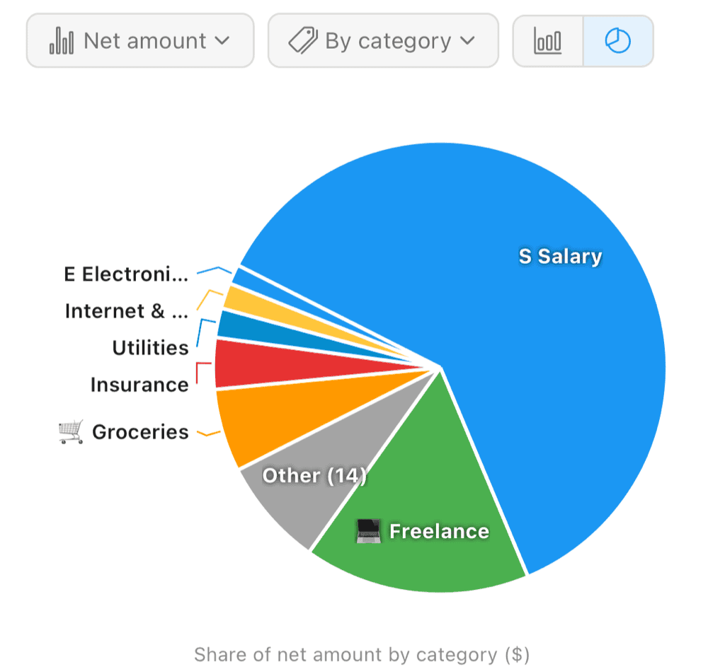
Net amount by category as a pie — each slice is a category's share of the total
The pie is grouped and measured the same way as the bar chart, so pairing By category with Net amount gives you a color-coded slice per category, and the smaller categories still collapse into a single Other slice.
Inspecting a Bucket
Tap any bar, row, or slice to select it. A detail panel below the chart breaks it down:
- Transactions — How many transactions are in the bucket
- Income — Total income
- Expenses — Total expenses
- Net — Income minus expenses
- Share of total — The bucket's percentage of everything shown
From there you can drill deeper:
- View Transactions — Open the full transaction list for that bucket
- Explore — Jump into the Explorer to slice the same set of transactions by another dimension
Before you select anything, the panel prompts "Tap the chart to see details."
Choosing a Time Range
Use the date selector (calendar icon) to set the window — from Past 7 Days through All Time, or a Custom Filter for an exact date range. Every measure and grouping respects the selected range.
Related Features
- Reports Overview — All reporting tools
- Cash Flow Report — Income and expenses over time as an area chart
- Explorer — Drill down and regroup any set of transactions
- Categories — How transactions are classified into the category bars
- Transfer Detection — How transactions land in the Transfers row